My handwriting – a way of expressing myself

You may have noted that there has been some recent discourse about handwriting and its proven benefits for cognitive development and learning. While engaging in an online discussion, I realized that my own handwriting has been shaped by two persons:

• Birgitta #. and Inger #. – my first- and third-grade teachers (I skipped second class) who helped me and my classmates produce a neat and readable cursive. (It’s really hard to imagine a Swedish class of seven- to nine-year-olds doing this today!)

• Edward Bell – the British art director who designed the David Bowie album Scary Monsters (and Super Creeps). The scan below shows a handout I prepared for a presentation in English class. (Click on it to see the entire page.) I imitated Bell’s style, I adopted it and I kept it as a way of expressing myself.

An interesting criteria for a really poor presentation

Today, I attended a ten minute presentation which made me so impatient that I had to restrain myself. As I was a guest, I felt that it was improper that my eyes (investigative), the expression on my face (disgruntled) and my body language (tense) gave away my feelings. I needed to relax fast and attain the same blank pose as the other members of the audience.  Accordingly, I decided to start counting backwards from 200.

Hereby, I define the ”200 TEST” for public speakers: if your presentations make people count backwards from 200, you should perhaps do something about them.

The relief of submitting a complex writing assignment

Being overly empathetic, I have a tendency to engage a little bit too strongly in my writing assignments. Sometimes, it may seem that my life hangs in the balance. And the more complex the article is – regarding e.g. facts, connections, background as well as social, professional and political considerations – the more I attack it like a sinewy prizefighter in an MMA tournament.

I’m a bit ambiguous here

On the one hand, my personal doctrine is to go all the way in, no matter what assignment, mission or relationship is handed to me. This virtuous and emotional commitment is well illustrated by an extraordinarily passionate performance of this certain (extended) Canadian band.

On the other hand, it may put some stress on my system. People keep pointing out this to me, but either I have not understood it yet, or I have decided not to listen. Something in me believes that you and I are gonna live forever.

Anyway, it’s always a joy to press Send and hand over the tamed and managed complexity to the editor.

Silence falls in the study.

And so I feel safe and alive for a while in the ”vacuum created by the arrival of freedom”.

Illustration: Writer by Ivan Koulikov (1875–1941)

Communication of Science: Out with the old and in with the new!

This post was originally published in Swedish at the Vetenskap & Allmänhet website. “VA is an independent Swedish non-profit membership organization that works to promote dialogue and openness between researchers and the public.”

I harp on about it all the time, so I may as well carry on here too: The research community today is weighed down by a communication culture that is not only unnecessarily restrained but in many ways outdated.

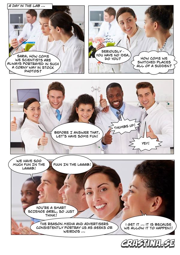
In part, I’m talking about the forums where researchers get together to present data and discuss results (peer-to-peer scientific communication). Here are some examples: text-heavy layout in scientific journals, overloaded research posters, and general lack of boldness and imagination when it comes to how to deliver a powerful presentation.

And secondly, I’m talking about the dialogue between researchers and the world (science dissemination). Here, a devoted vanguard of educators are doing an amazing job, but at the same time too many researchers still undervalue and neglect EPO (Education and Public Outreach).

Now I’m not saying that things are as bad in Sweden as they are elsewhere. In fact, when you raise your gaze and peer out over the world, a clear pattern emerges: the more hierarchical, tradition-bound and prestige-oriented the academy is, the duller and more austere is its culture. To illustrate this, here’s a little story that reached me from a former communist country. The old professor, who was very influential in his country’s scientific community, was not interested in learning about presentation techniques; He believed that data and results should speak for themselves. He even implied that communication training is a way of obtaining illicit advantages.

Unfortunately, it’s not just former Eastern bloc professors in gray gabardine who oppose progressive ideas. The American researcher and communicator Adria Le Boeuf – who has tirelessly engaged in outreach activities such as improvisational theater in Lausanne – wrote the following in an article (link below): “In research, we are accustomed to the driest possible presentation of results: the scientific paper. When findings are presented clearly, in simple language, with a hint of storytelling or charisma, many scientists feel practically manipulated.”

Despite all this, I’m not particularly worried about the future. Students and younger researchers have grown up in a completely different world. They find it natural for explanatory graphics to replace text (visual abstracts, for example) and for research posters to consist of headlines for interesting projects rather than complete information. They have studied TED/TEDx presentations on YouTube and understand the value of a passionate and individual lecturing style. Many of them see their bachelors, masters or Ph.D. as a platform for career roles where communication is at the center – from entrepreneurship right through to science journalism.

In fact, I would like to say that it is a privilege for all of us to find ourselves in this period of upheaval – out with the old and in with the new!

Olle Bergman, freelance writer and lecturer; project leader of Crastina – “the new wave of communicators of science”. (Translation from Swedish by Michael Hinton)

Lamenting the wordiness of learned people (Crastina Column, April 2017)

Being the project leader for Crastina, I introduced  the theme of April & May – ”short & punchy” – with this column. Its main message can be summarised by paraphrasing Coleridge: “Text, text, everywhere, Nor any message to get.” 

Exhibit A: The Decalogue, or Ten Commandments, hugely impacted the world since the 7th century BC.

And yet it was printed (according to tradition) on just two stone slabs.

Exhibit B: The article Molecular Structure of Nucleic Acids: A Structure for Deoxyribose Nucleic Acid by Francis Crick and James D. Watson hugely impacted the world since 25 April 1953.

And yet it filled just one page of the scientific journal Nature.

Exhibit C: The online document The Manifesto for Agile Software Development hugely impacted the world since February 2001.

And yet, it has fewer words than the text that you are currently reading.

These three texts are the result of extended observation, analysis and thinking. But they all manage to convey ideas concisely. To make these ideas easy to grasp, the creators removed any material that could obscure the reader’s view.

We can learn three things from this:

  • Time spent by the sender, is time saved by the receiver.
  • Superfluous information hides core content.
  • Concise writers have to be brave: to make a point is to take a stand!

Unfortunately, many professionals are moving in the opposite direction, helped by electronic writing tools. As the pace of modern life increases, so does wordiness. Brevity and clarity take time; lengthiness and murkiness is a sign of haste. Every ten minutes a writer saves, the reader loses.

Here are a few ways to avoid wordiness:

  • Make sure you know your subject. If you don’t, read more.
  • Before you start typing, define a first version of your main ideas. Maybe with a pencil and a notebook?
  • There are always things you can remove from your text. Kill your darlings.

Shakespeare once wrote that “Brevity is the soul of wit”. I agree.

And I am done here – full stop.

Regarding style in popular science

After reading the unusually well-written prose of the science blog Espresso Science, I made the following reflection:

pexels-photo-102100Producing readable copy with no apparent style always works.

Being the nimble wordsmith, skilfully forging exquisite prose may very occasionally work wonders and give your message extra oomph. But most likely, stuffing the text full of various style elements from the book of rhetoric will make the reader’s mind wander and lead it astray in a wondrous forest of daydreaming, far from the sunlit pastures of the actual content.

What we really should aim for as writers, is well-crafted texts with just a pinch of deliberate style to create a personal voice.

A symbol rising from its East Prussian grave

The excellent band Kent is suddenly announcing their last album with a magnificent video, showing the Swedish winter bleakness in all its glory.

There is a disturbing detail in this video which must have escaped the attention of the producers: the white flag with a black cross. I assume that it has been their intention to show a black and white representation of the Swedish flag.

But for anyone familiar with German history, this flag is something completely different: it’s the banner of the Teutonic orderOrdo domus Sanctæ Mariæ Theutonicorum Hierosolymitanorum.

Anyone who is familiar with the historical, ideological and political connotations of the narrative of the Teutonic order (and their military disaster at Tannenberg in 1410) will be very confused by the use of the symbol in the video; I would say that it hurls it along a totally different trajectory.

The inverted pyramid disciplines your thinking

I have always thought of the inverted pyramid as an editorial technique which makes life simpler for both writer and editor—a pragmatic way to serve a front-loaded text to a reader who refuses to wait or concentrate.

But then I stumbled over this excellent article by Chip Scanlan from the Poynter Institute where he writes:

It’s also an extremely useful tool for thinking and organizing because it forces the reporter to sum up the point of the story in a single paragraph.

So true – as soon as you have run your notes and source texts through the Five Ws machinery your text will write itself. The lesson to be learned here is that five minutes of focused thinking can replace one hour of aimless writing agony.

Kitten Covers, Batch 1: Low-Life by New Order and Pablo Honey by Radiohead

http://thekittencovers.tumblr.com/post/12151314451

Low-Life by New Order

I was a great fan by Joy Division, but never really fell for New Order during their heyday. The music definitely has some atmosphere, but the song writing isn’t great on most of the tracks, nor is the singing. The use of melodica was a wonderful part of the song Your Silent Face from the album Power, Corruption & Lies, but here I find it superfluous most of the time.

Number of stars: **
Will I include it in my living music library? No.

Pablo Honey by Radiohead

Sounds a lot like a band trying to imitate Radiohead, Smashing Pumpkins and Nirvana; there was a lot of them around in the late nineties. Creep is a great song, but as we have seen from YouTube, it really needs an exceptionally talented singer. (It’s actually a very primitive song, with four chords being repeated over and over again.) To me Pablo Honey represents a proto-Radiohead—the caterpillar which eventually will be the butterfly with two marvelous album wings: The Bends and OK Computer.

Number of stars: ***
Will I include it in my living music library? Creep + perhaps some other song.

[color-box]

The Kitten Covers Tumblr blog presents legendary albums where the people of the original artwork has been replaced by kittens. As I thought the concept was genius, I decided to write short reviews of all these classic albums.

The rules are simple: I have to listen through the entire album (but if a song disturbs me, I may skip it and go to the next). There is no need to focus entirely on the music; most probably, I listen while working, doing my chores or driving.

* = Ehem, definitely not my cup of tea.
** = Well, once perhaps—but not again.
*** = OK, I could listen to this again. Maybe.
**** = Great music. Ought to give it a closer look.
***** = Wow, this belongs to my living music library.

[/color-box]